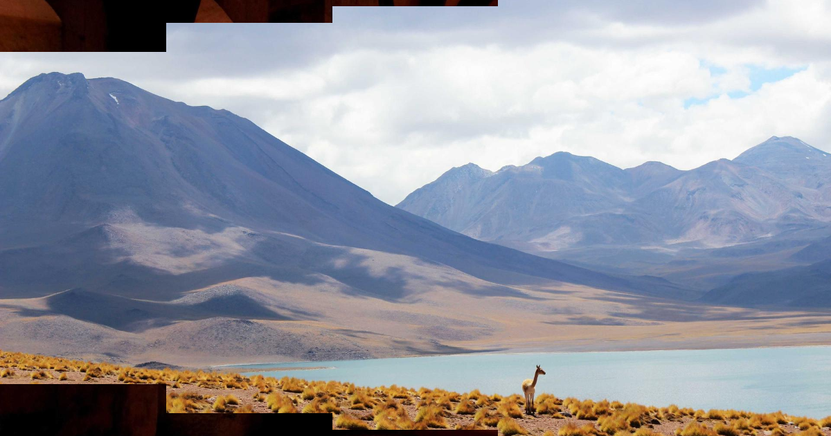
Ripple Reveal WebGL
Built with WebGL, GLSL, CSS Custom Properties, Vanilla JS, Tailwind CSS v4
WebGL canvas replaces CSS mask entirely. A fragment shader crossfades two slide textures behind a radial mask while Gaussian-enveloped sine rings physically distort pixels at the wave front — true refractive warping, not a visual overlay.
Ripple reveal WebGL
Circle expands from a configurable origin, distorting image pixels at the wave edge like light refracting through moving water.
Top-left origin
Set --origin-x: 0%; --origin-y: 0% on the container — the same shader handles any origin.
How it works
A fullscreen <canvas> element replaces all slide markup. One GLSL fragment shader does everything in a single pass:
- Compute aspect-correct distance from each pixel to the wave origin
- Apply Gaussian-enveloped sine ring distortion near the wave front
- Sample both slide textures at the displaced UV coordinates
- Mix prev/curr via a
smoothstepradial mask
Ring distortion
float radius = uT * uRingSpeed * 2.0;
float x      = dist - radius;                        // signed dist from wave front

// leading edge: tight Gaussian bell; trailing wake: exponential decay (--decay)
float band = x > 0.0
  ? exp(-pow(x / uRingWidth, 2.0))
  : exp(x / max(uDecay * uRingWidth, 0.0001));

float freq  = uRingCount * 6.28318 / max(uRingLength, 0.001);
float rings = sin(x * freq);                         // oscillation in the band
float disp  = rings * band * uAmplitude * fade;

vec2 dir    = normalize(uv - origin + 0.0001);
vec2 dispUv = uv + dir * disp;                       // push pixels radially
x = dist - radius is negative ahead of the wave, zero at the front, positive behind. The Gaussian bell (band) ensures only pixels close to the wave front get displaced — the effect stays confined to the ring, not the whole image.
The trailing wake (x < 0) uses a different envelope: exponential decay scaled by --decay. At --decay: 0 the exponential collapses to zero instantly, giving a clean leading edge only. At --decay: 3 (default) the distortion fades out slowly behind the wave like a comet tail.
Radial mask crossfade
float maxDist     = sqrt(aspect * aspect + 1.0) * 0.75;
float maskRadius  = uT * maxDist;
float halfFeather = uFeather * maxDist * 0.5;
float maskAlpha   = smoothstep(maskRadius + halfFeather, maskRadius - halfFeather, dist);
gl_FragColor = mix(prevColor, currColor, maskAlpha);
smoothstep produces the soft feather zone. maxDist * 0.75 covers the farthest corner from any origin position.
CSS vars → WebGL uniforms
private readConfig() {
  const cs = getComputedStyle(this.container)
  return {
    originX:   parseCssPct(cs.getPropertyValue('--origin-x'),      0.5),
    amplitude: parseCssNum(cs.getPropertyValue('--distort-scale'), 40) / 1000,
    ringSpeed: parseCssNum(cs.getPropertyValue('--ring-speed'),     1),
    decay:     parseCssNum(cs.getPropertyValue('--decay'),          0),
    // ...
  }
}
CSS vars on the container still drive all config — same API as a CSS-only component. readConfig() runs every frame so live CSS edits take effect without restart.
Texture management
All slide images preload into WebGL textures before the first frame:
await Promise.all(this.srcs.map((src, i) => this.loadImage(this.textures[i], src)))gl.UNPACK_FLIP_Y_WEBGL flips Y on upload so UV (0,0) maps to the image top-left (matching CSS convention).
Ken Burns zoom
UV scaling in the shader — no CSS transform needed:
vec2 zoomUv(vec2 uv, float zoom, vec2 origin) {
  return (uv - origin) / (1.0 + zoom) + origin;
}
uKenBurnsCurr goes 0→0.1 during the transition; uKenBurnsPrev stays fixed at 0.1 (outgoing slide is already fully zoomed). Both run from their own independent clocks so the outgoing slide doesn’t stutter when a new transition begins.
Accessibility
if (!window.matchMedia('(prefers-reduced-motion: reduce)').matches) {
  new RippleSlideshow(el).start()
}
Skip start() entirely — don’t just reduce duration. The Ken Burns zoom alone can trigger vestibular symptoms at full speed.