Ripple Reveal
Built with CSS Mask, CSS Custom Properties, @property, CSS Animations, Vanilla JS, Tailwind CSS v4
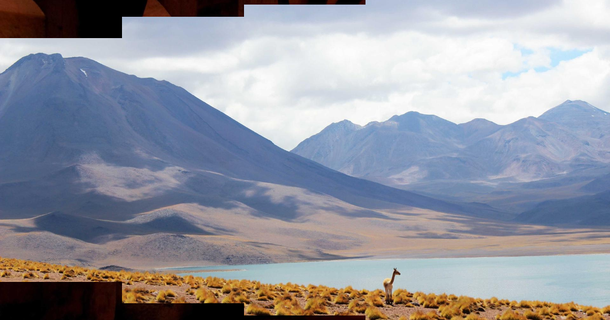
CSS mask + radial-gradient expands the incoming slide outward from a configurable origin point. A single @property --p drives the radius; a feather zone between the two gradient stops creates a soft, liquid ripple edge.
Ripple reveal
Circle expands from a configurable origin, like a drop hitting still water. The slideshow auto-advances every 5 seconds with a 1.2s reveal animation.
How it works
The key is @property --p — a registered CSS custom property that can be animated with @keyframes. Without @property, animating --p inside radial-gradient() doesn’t work because the browser can’t interpolate unregistered custom properties.
@property --p {
  syntax: "<number>";
  inherits: false;
  initial-value: 0;
}

@keyframes ripple-reveal {
  from { --p: 0; }
  to   { --p: 1; }
}
The active slide computes a radius from --p, then derives two edge stops for a feather zone:
.slideshow-ripple-reveal > .active {
  --radius: calc(var(--p) * 150%);     /* 150% ensures circle covers corners */
  --edge-in:  calc(var(--radius) - var(--feather) / 2);
  --edge-out: calc(var(--radius) + var(--feather) / 2);

  mask: radial-gradient(
    circle at var(--origin-x) var(--origin-y),
    #000 var(--edge-in),
    transparent var(--edge-out)
  );
  animation: ripple-reveal var(--duration) var(--ease) forwards;
}
The --feather gap between --edge-in and --edge-out softens the expanding ring. Larger values → blurrier edge; 0 → hard circle wipe.
The origin is configurable via CSS custom properties on the slideshow container:
.slideshow-ripple-reveal {
  --origin-x: 50%; /* 0% = left edge, 100% = right edge */
  --origin-y: 50%;
  --feather: 20%;
  --duration: 1s;  /* JS reads via getComputedStyle — no separate constant needed */
  --delay: 5s;     /* time between slides — also read by JS */
  --ease: cubic-bezier(0.4, 0, 1, 1); /* ease-in: slow start → fast expand */
}
150% for the max radius guarantees the circle covers all four corners regardless of origin position. If you set --origin-x: 0%, the farthest corner is the top-right; 150% of the diagonal still clears it.
Slide z-index management
CSS animation doesn’t handle stacking — JS does. Each transition bumps a monotonically increasing zCounter so the incoming slide always paints above everything:
slides[idx].style.zIndex = String(++zCounter)
slides[idx].classList.remove('active') // force animation restart
slides[idx].classList.add('active')
The remove + add in sequence forces the browser to restart the @keyframes animation even if the slide was previously .active. After animDuration + 200ms (read from --duration on the container), the previous slide drops its .active class and falls to z-index: 0.
Ken Burns effect
Active slides get a slow scale(1.1) via a long transition:
.slideshow-ripple-reveal img {
  transform: scale(1);
  transition: transform 10s linear;
}

.slideshow-ripple-reveal > .active img {
  transform: scale(1.1);
}
The 10s duration means the zoom is barely perceptible within a 5s slide hold, but visible as slow drift — the Ken Burns effect without JS.
Accessibility
if (!window.matchMedia('(prefers-reduced-motion: reduce)').matches) {
  initRippleSlideshow(el)
}
When prefers-reduced-motion is set, skip initializing the slideshow entirely so slides don’t auto-advance and no animation runs.
Top-left origin
Set --origin-x: 0%; --origin-y: 0% inline on the container — ripple expands from the top-left corner.